Customer experience, business and engineering go hand in hand

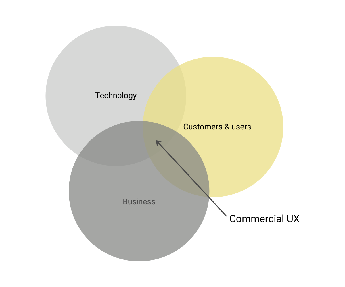
When insights into user behavior, business and engineering come together, we get a very strong cocktail that can put your project and your business ahead of all the others.
In Vertica we talk about commercial UX, because usability is not just about the users - it's also about the coherence with business and engineering.
Vertica's UX consultants help you achieve a successful project by combining user and customer insights with:
- Specific knowledge of how your customers want to and have the ability to act on a website
- A deep understanding of your business that also includes suggestions on how to sell more online
- A knowledge of technical possibilities and limitations


A safe foundation
In Vertica, the UX consultant is a driving force in the clarification phase. Here, the goal is to define the solution we are going to build. In the clarification phase, the UX is your sparring partner and consultant by, among others:
- Have an overview of the customer journey across digital and analog channels
- Continuously visualize solution sketches that everyone can understand and discuss
- Record how other Vertica customers, competitors, and other players around the world solve challenges similar to those we see in your digital business
- Build a bridge between business and engineering

It is everyday life for the UX consultant to conduct interviews and e.g. testing of wireframes and prototypes with users - also in contexts where the upcoming user group, for example, is deeply specialized. Therefore, it is also a natural part of the clarification process to supplement the existing customer insight with further in-depth studies in cases where you have doubts about specific areas of customer expectations.
The UX consultant takes the emotions out of design discussions and helps make a plan that is strictly based on arguments founded in business- and customer insights.
The smallest detail and the overall overview

A good UX consultant is detail oriented and engage in the smallest detail in the user interface. For example, all combinations of images, product data and offer types must be 100% controlled. But also important interaction details that determine whether the user understands that a product is in the basket.
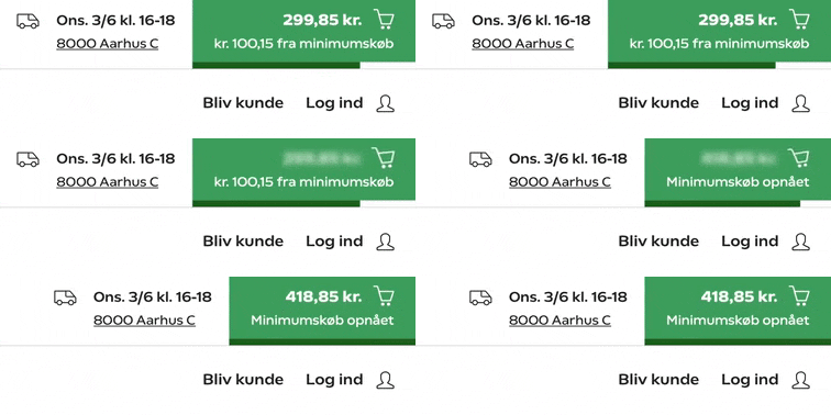
The small detail may also be the one that means that the user is gently "nudged" to buy some more. It is, for example, far from always rational why users put more in the basket to obtain free shipping - and this insight can be translated to make a virtue out of visualizing that "it's not much further now". The user's desire to fill up the basket is supported by the small visual detail. At Coop.dk MAD we have cultivated such details - they are important for the users, but also for the business.
Go-live optimization
The good webshop is always improving. In Vertica, the UX consultant helps you run a process where your e-commerce solution's conversion, basket size, revenue and profit increase gradually and safely.
By conducting controlled experiments, we gain insight into what works and does not work with your customers. By analyzing data and supplementing with user tests, we find out where we can most likely produce new results.
We help you, for example, with optimizing:
- Searches that fail to deliver, so your virtual shelves do not appear blank
- Category pages design so they sell best
- Confident messages to hit your users
- Landingpages to bring as many buyer-able users as possible to a transaction
- The visibility of features that you have spent money and time developing
We make sure that changes to the webshop are not made in panic based on input from e.g. a single customer call, but there is evidence that the change will have a positive effect on your revenue in the short and long term.
