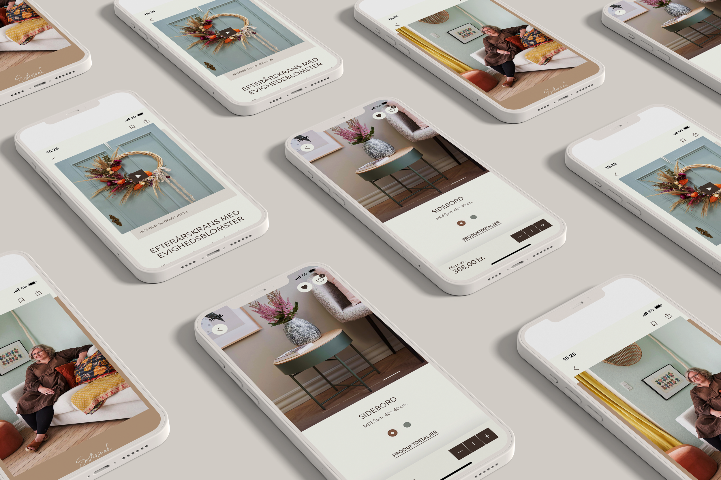
Users who have used the app convert 250% better than regular web users.
The preferred touchpoint
Søstrene Grene expects the app to raise customer lifetime value for the dedicated customers. By getting even closer to customers, the app is expected to become the preferred touchpoint for core customers.
It has already been launched in six European countries, where it has been very well received. In addition, the following results can already be seen:
- Since its release at the end of May 2022, 127,000 users have downloaded the app.
- In two days, the app reached second place on the list of most downloaded apps in Denmark, and it has an average rating of 4.9 out of a possible 5.
- Users who have used the app convert 250% better than regular web users.
- Users who have used the app and looked at DYI and inspirational articles convert 380% better than regular web users.
More than just loyalty
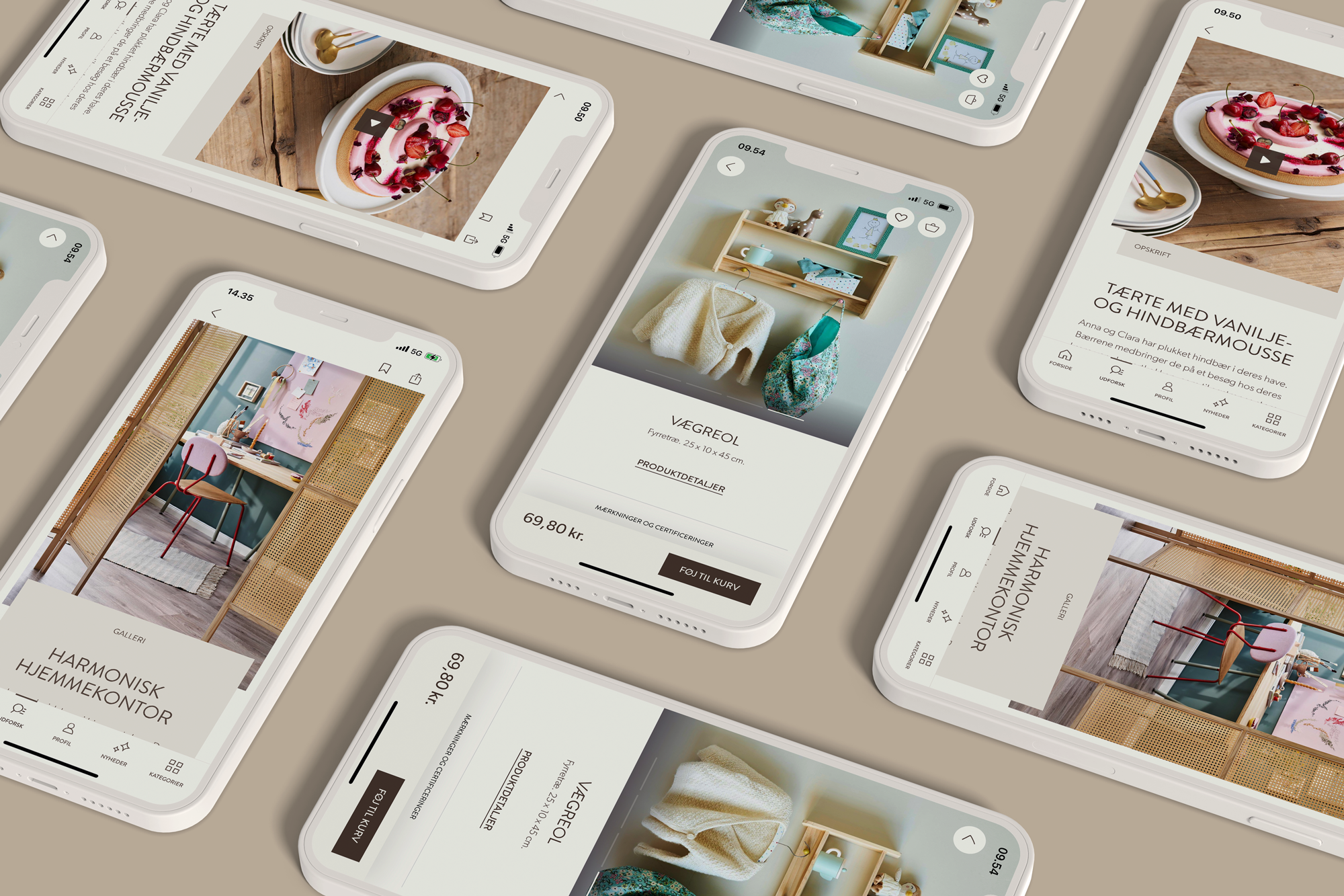
The app is like a lifestyle magazine, where you'll find everything from inspirational articles, knitting patterns, in-store finds and more. It tailors its content to the interests and needs of the individual user.
This also means that the app is not a customer loyalty club in the classical sense. Rather, it is about building a community around the 'sisterhood' that Søstrene Grene's loyal customers feel in relation to the brand and their fellow sisters (Søstrene means The Sisters in Danish).


Jacob Schriver,
Digital Platform Product Manager
Bridging offline and online
The app develops the omnichannel experience, allowing customers to bring the quirky atmosphere of the stores home in their pocket. It's the absolute shortest route into Anna & Clara's universe, wherever the customer is.
At the same time, the app will enrich the shopping experience in the physical store. Among other things, customers can scan products in the store and get product information and inspiration. There are more initiatives in the pipeline that will allow customers to activate the app when exploring Søstrene Grene's stores.
The technology behind it all
For those of us who like to geek out on the technical foundation of the app, here is what we can add: the app is based on a regular headless content hub (themes/articles, DIYs and galleries), built in Umbraco with a product feed from the underlying InRiver PIM. Customer segmentation and customer data are handled in mParticles CDP. The app frontend is written in SwiftUI for iOS and Kotlin and Jetpack Compose for Android.
The app has been created in close cooperation with ManyOne, who contributed to the overall loyalty concept and graphic design.


